7 super hero moves to finding that perfect business name
- Mash-ups
Select two topics and make a list of words associated with each topic, such as ‘Space’ and ‘Animals’ and then join single words together from each list to come up with a funky and unique name. For example greeting card companies ‘MoonPig.com’ or ‘FunkyPigeon.com.’
But if you don’t want to be too risky then why not use words that are more meaningful to your business and combine them together, such as ‘group’ and ‘coupon’ which made Groupon. Another example is ‘your delivery’ which made Yodel the delivery service company.
- Go abstract and abbreviate
Find a word, place or item that is key to your business and make a short art of. This is what Cisco did with Sans Francisco, where the company was founded.
- Use Foreign words as inspiration
This can give your business a sophisticated appeal, such as Lego which comes from the words ‘leg godt’ which in Danish means ‘play well’ or Daewoo which means ‘great house’ in Korean.
- Use a Map
Maps have thousands of places, rivers and mountains. Find one that best suits your brand. Such as Fuji (from the highest mountain in Japan) which portrays that the company aims high and goes above and beyond. Amazon named after the largest river in the World (by volume of water) or Adobe which was a creek running close to the founder’s house.
- Use literature, history and mythology
For example the name Nike is the Goddess of victory in Greek Mythology (see title image banner) or the novel Moby Dick which inspired the name Starbuck (from Starbuck, the young chief mate of the Pequod).
- Invent a new spelling for a word
Think of a word that is central to your business and reinvent its spelling. This is my personal favourite hence why I used it. For example ‘dsgnuk’ is an alternative spelling for the word ‘design.’ This also makes it easier to find the website name, as common words and names will be taken on the net. Reebok did the same with the word ‘rhebok’ which is an Africa Antelope. This technique is becoming very popular among big companies. Flickr, Tumblr are two examples where they have dropped the last vowel.
- Open the Dictionary
If your still struggling then why not pick up a dictionary and find a meaningful work, this is exactly what the social media giant Twitter did!
Remember start with a big list and narrow it down, ask others and get their feedback. Say it out loud and see how it sounds. Good luck and happy naming!Related articles by Kabir Ahmed:
- How colour dictates our behaviour
- 5 Logos with hidden meanings
- Repetition is recognition
- 5 reasons to make your website mobile savvy
- What do web developers and melons have in common?
*Nike is the Goddess of victory in Greek Mythology, (this is a modern illustration by a Russain artist) https://vgtimes.ru/news/35875-boginya-pobedy-nika-poyavilas-v-smite.html
What do web developers and watermelons have in common?
I was at the local fruit market buying a watermelon. I really didn’t know how to determine whether it’s ripe or not. Is it the weight or colour? Do I pick one out of the bottom thinking that they might be hiding the best ones there?
This in a bizarre way got me thinking about web developers because on face value they look perfect and sit pretty and seem to know it all but how do you know if they’re the real deal? How good are they? Can they do the job? Here are some key questions to ask in order to identify the pros from the amateurs.
Is this your full-time job?
Freelancers are often out there to make that extra bit of cash and will give you a very cheap quote, but they also have a full-time job and are busy; they will probably not meet any deadlines and will be hard to get hold off. In some cases they stop answering your calls because they can’t find the time to finish the job. It is often said if you pay cheap you pay twice and in this case it’s certainly true.
Will you be using Word Press to create my website?
If they start telling you they will create your site from scratch using Java Script or some other language then its best to cut your losses and move on. These days it is all about WordPress as it’s easy to build, use and Google loves it!
How will you make sure my website is secure?
A good web developer will ensure that they install a firewall to monitor people visiting the site. They should also inform you of using a secure server (where your website is backed up) so the information is encrypted when it travels, just in case it gets intercepted by hackers.
Can you use Adobe Photoshop or Illustrator?
There you go! The next time you’re choosing a web developer, think watermelons.
Related articles by Kabir Ahmed:
5 reasons to make your website mobile savvy
Responsive Web Design (RWD)
In simple terms, this is about how your website looks regardless of what device you may be using. It doesn’t matter if it’s a 40 inch cinema display or a 4 inch smart phone, the code and design of the site should adapt to give you the optimal viewing experience.
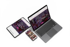
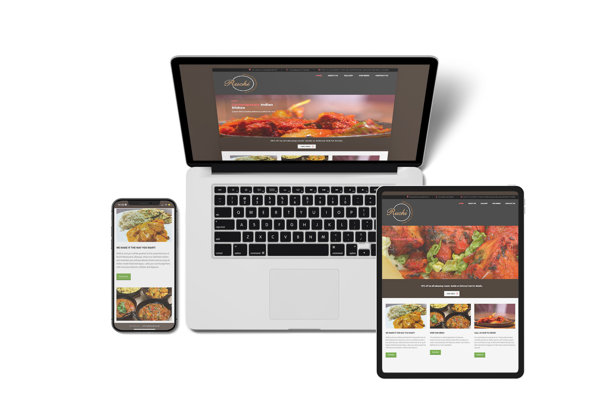
Here is what a responsive website would look like compared to a static website:
Reason 1: 70% of people shop online
According to Ofcom (Media regulatory umbrella body), over two thirds of people in the UK spend roughly two hours a day shopping online, mobile banking and checking their social media profiles. With 98% of the UK now able to access 4G, this surge is only going to increase. A responsive website is the only way to future proof your presence online and ensure that you are able to take advantage of the growing online business market.
Reason 2: The three second rule
According to Google, people are prepared to wait only 3 seconds for a website to load before they move on. If your website is static it is likely to take a long time to load on a smartphone or tablet and your customer is likely to then move to your competitor’s site.
The sign of a good website is if the user can find what they’re looking for with no more than three clicks.
Reason 3: Majority shop using mobile devices
As you can see from the Ofcom data graph below, 52% of all usage on the internet is via smartphone or tablet. This is data from 2014 and considering it was on an exponential curve three years, it’s likely to be significantly higher now. This makes it even more essential for your website to be mobile responsive.
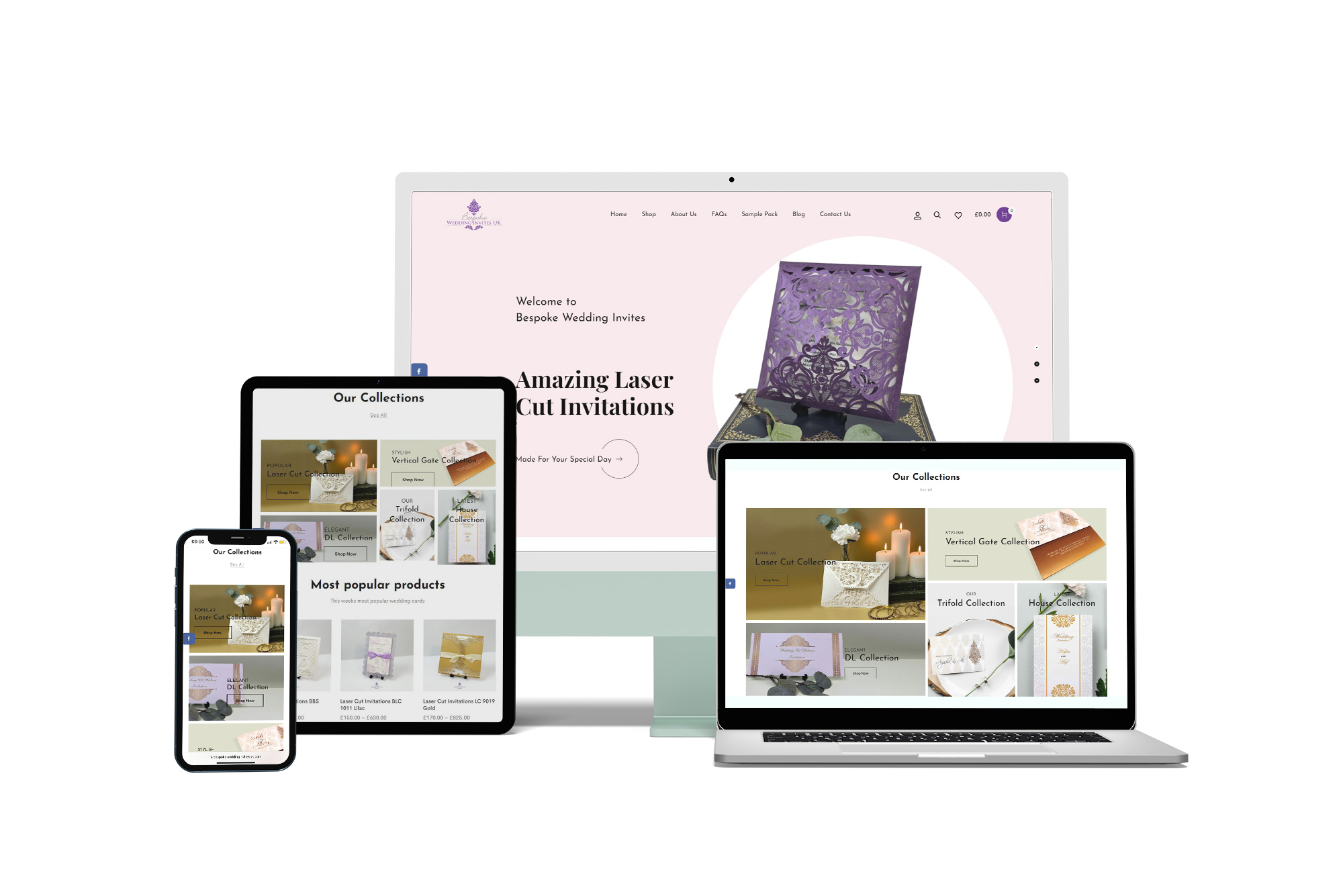
Reason 4: Google will love your website
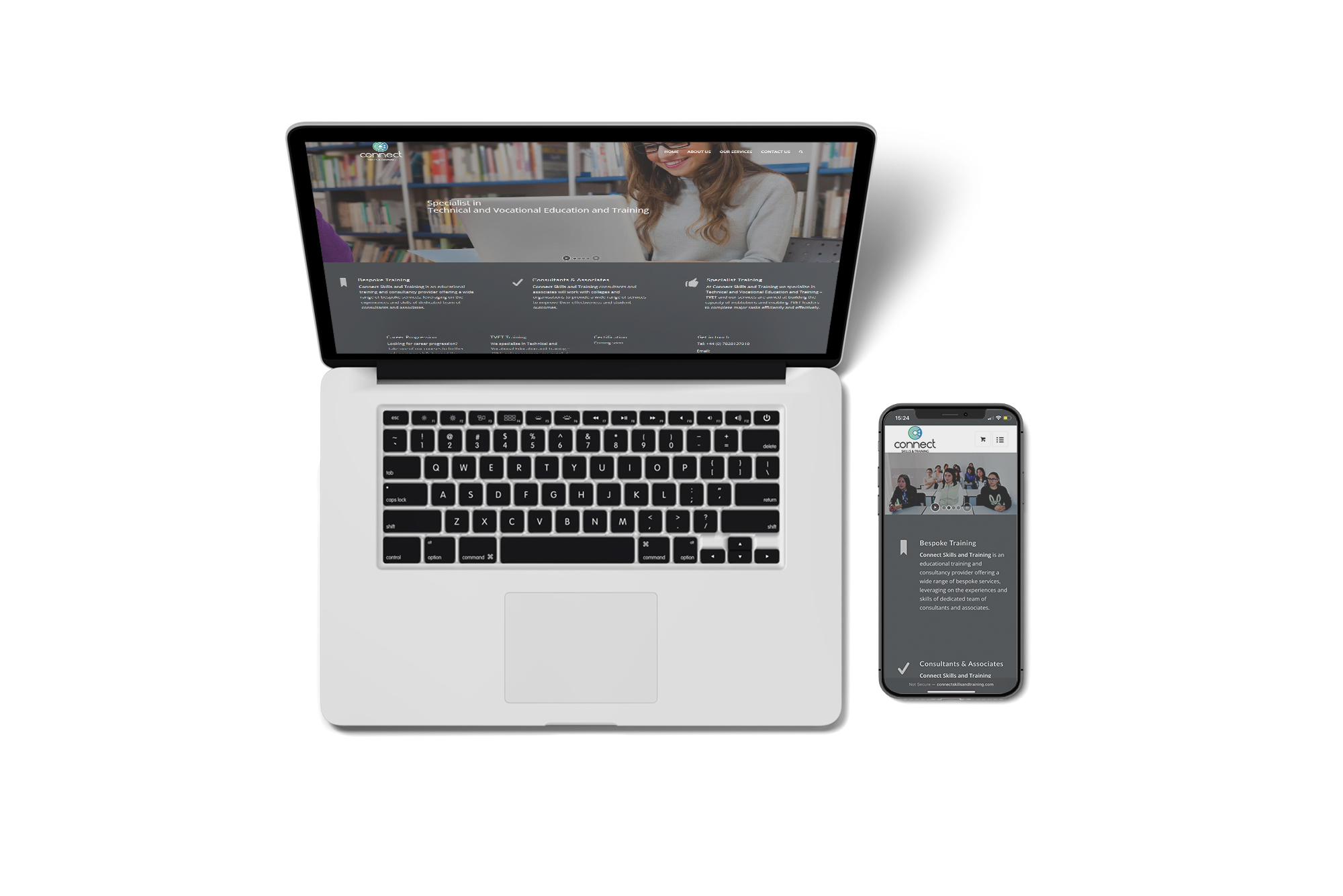
In 2016 Google changed its algorithm to favour mobile friendly websites and decided to penalise sites that are static by ranking them lower on the search engine. Thus by having a responsive website, you organically get the best of SEO (Search Engine Optimisation).
Do not take a shortcut and design and build a website using WIX, because Google is not a fan. It performs poorly on search results and because WIX uses a form of Flash technology, your website will not rank well. WordPress template is the most favourable.
Reason 5: Lower the bounce rate
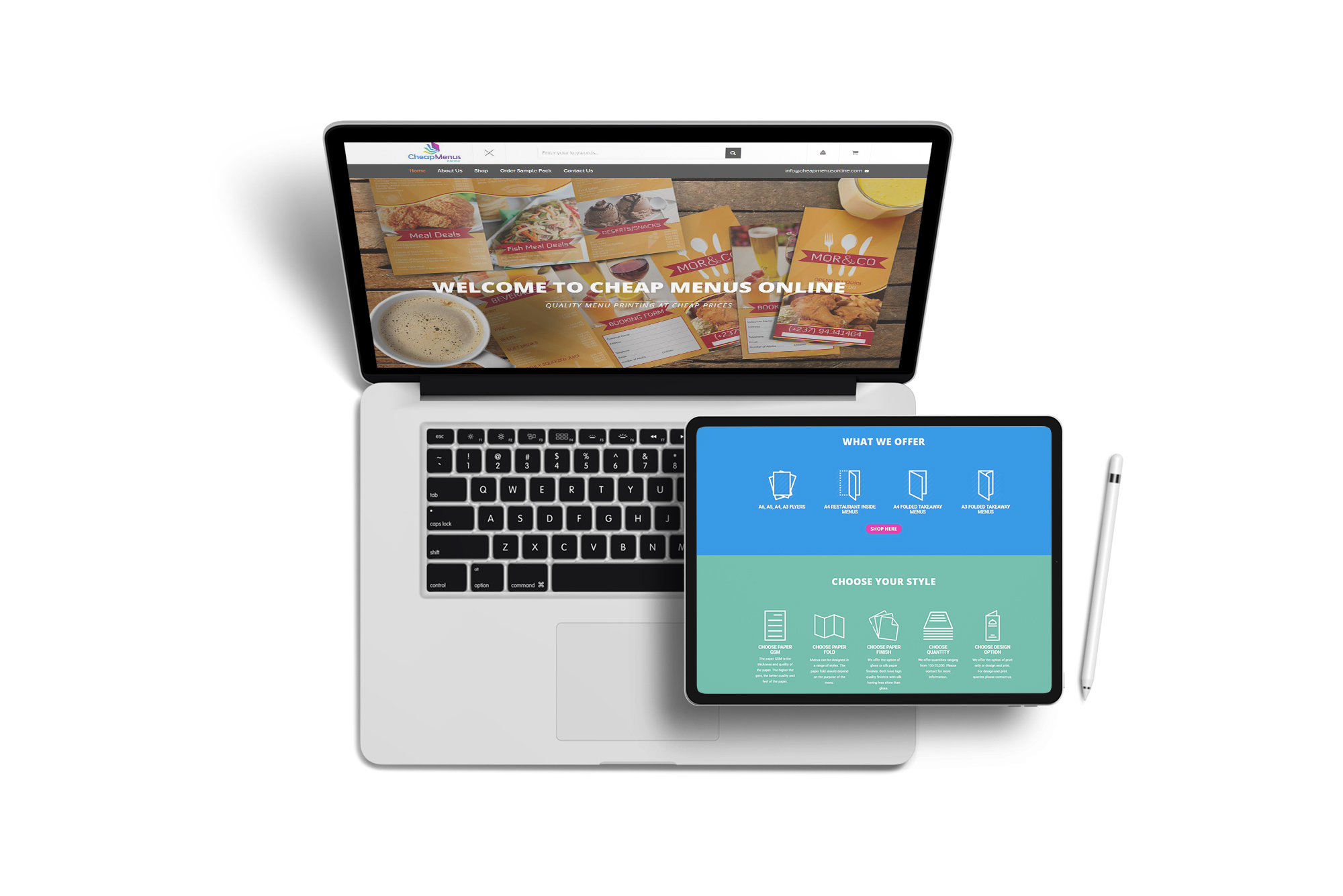
We all know the frustration of having to expand the screen, waiting for pages to load and then trying to figure out what the pending image may look like.Why put people through that? Having a smooth and easy User Interface where information has a hierarchy (more important text sized bigger) will ensure you can dictate where the user looks first and guide them through your website rather than leaving them lost. This will prevent the ‘bounce off the site’ behaviour users now resort to in order to find a less stressful website.
Try it out yourself!
Step 1:
Visit your website on your phone or tablet. How does it look? Can you navigate and find what you need with no more than 3 clicks? Can you get directions and contacts? How easy is it to buy or search for a product or service?
Step 2:
Log into your Google Analytics account, and see how much of your traffic is coming from mobile devices. If you don’t have Google Analytics, get your web developer to add it ASAP!
If you need help, just drop us an email or call us.
Related articles by Kabir Ahmed:
How colour dictates your behaviour
All big organisations and businesses carefully select the colours for their logo and branding they use.
Here’s why:
YELLOW= Hunger!
Yellow is the colour most commonly associated with hunger which is why the largest fast-food chains McDonalds and Subway both use it boldly.


Yellow is also the colour that catches the eye faster than any other colour; it is always seen in signs and building work. JCB is also a good example.
RED = Increases the heart rate!
This is a very powerful colour and is scientifically proven to increase your heart rate and blood pressure. It also portrays passion hence why the colour dominates Coca-Cola, Vodafone and Richard Branson’s Virgin Enterprise.


ORANGE = Fun and playful
There is one company that has owned this colour by quite literally naming themselves ‘Orange’, even though it has now merged with T-Mobile to form EE mobile. If you Google ‘Orange’, their logo comes up as the third highest ranked image! We also have EasyJet, everyone’s favourite budget airline.


BLUE = Clean and cool
This colour signifies dependency and trustworthiness. This is why the world’s largest employer the NHS and Barclays uses this colour wholeheartedly.


Blue is also Mark Zuckerberg’s favourite colour since he is colour blind. Blue is the richest colour he can see and why he decided on the Facebook logo being blue. It is also reported that his house is also painted in different shades of blue.

PURPLE = Loyalty
This colour makes people nostalgic by bringing back memories and allows people to reminisce and become sentimental. Cadbury’s Dairy Milk takes this to such a degree that they have claimed the right to a specific purple colour tone, Pantone 2658c – which is officially Cadbury purple. Nestlè tried to challenge this copyright but failed and now Cadbury has the right to the colour exclusively for its chocolate and drinks packaging.

GREEN = Emotionally positive
It signifies nature, rebirth and growth. It is used to show abundance and darker green seeks to represent luxury and wealth. It can exude class, sophistication and prestige, which is why the famous Harrods loves the colour.

However, the most famous brand that tried to take ownership of the colour is no other than Starbucks. Their logo was originally brown to signify coffee beans, but they decided to move to green to get away from brown’s association with dirt and soil.

WHITE = Every colour’s best friend
It is a neutral colour and hence associated with innocence, purity and spirituality. It is also the ruling colour for cleanliness and why it dominates beauty products. Apple has mastered the use of white in all its products and is the market leader in using white as it connects well with its design ethos: simplicity is perfection.
Feel free to share your thoughts and leave a message below.
We are the marketing and PR partners for the Oldham Enterprise Trust.
We are the marketing and PR partners for the Oldham Enterprise Trust.
Our team was responsible for the marketing material for the re-launch of the Oldham Enterprise Trust at Madhlo Youth Zone with chief guest Sir Norman Stoller announcing a £4m fund from the Stoller Charitable Trust to support young people in Oldham into work and setting up business opportunities.
The enterprise created a special promotional booklet, including roll up banners and a brand new mobile optimised website to help promote the work of the enterprise with young people and supporting the ‘Getting Oldham Working’ initiative.
Read the full story:
Dsgnuk helps set up Asian Business Leaders Group (ABLG)
Dsgnuk helps set up Asian Business Leaders Group (ABLG)
The ABLG is set to be the ‘go to’ organisation for business networking and support in the Asian community and wider Oldham. The organisation has also sponsored the Prestigious Oldham Business Awards 2017 a black-tie dinner and awards ceremony at Queen Elizabeth Hall on Friday, May 12.
Ansar Ali and Karim Ahmed from dsgnuk, have both been instrumental in helping to set up the organisation and we are proud to be marketing the organisation and its future events.
See the full story at:
Get inspired by these 5 clever logos all with a hidden meaning
Can you spot the hidden meaning in these 5 famous logos?
Logos and brands adorn our world. They are instantly recognisable and confer subliminal messages because they are designed using great creative ingenuity underpinned by research and thought.
A survey of 7,000 people across six countries, including the UK, found that more people can identify the golden arches of McDonald's than the Christian cross!
When a brand becomes so central to a person's thoughts and life experiences, the hidden message can be very powerful.
Here are five of my favourite:
- McDonald's
According to the BBC, McDonald's wanted to change their logo in the 1960's but their top design consultant told them not to. According to him, the golden arches symbolised 'a pair of nourishing breasts.' Whether it's true or not, their logo is one of the most recognisable in the world.
- FedEx
In design, we say 'less is more' but it's what you do with the 'less' that matters. The FedEx logo is the most creatively simple. The arrow between the E and X represents the forward thinking and outward looking vision of the company.
- Amazon
At first glance, the yellow arrow looks like a smiley face to represent the company as a friendly entity but if you look closely, the arrow begins at 'A' and finishes at 'Z' to illustrate the idea that you can practically find anything you need from the company.
- Pepsi
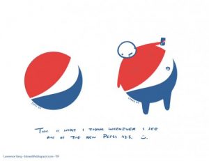
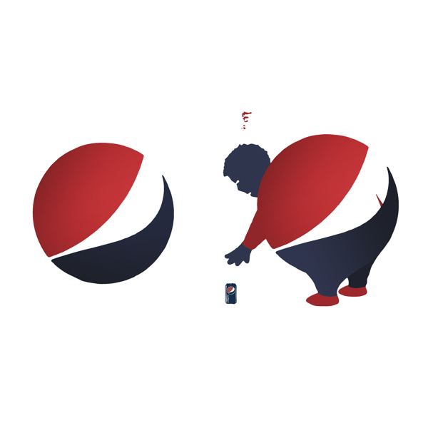
It took the design agency five months to complete the Pepsi logo and it was a costly one too (costing over 1 million dollars). It is said that the logo was inspired by the Da Vinci Code, Feng Shui and the Earth's Geodynamo. However, if you add arms, legs and a head onto it, it looks like an overweight person with his gut hanging out! However, I am sure that was not the intended purpose behind the logo!
- Apple
The mainstream media has made the Apple logo into a tale about the forbidden fruit from the “Tree of Knowledge” as per the Biblical story of Adam and Eve. The Apple designer, Rob Janoff, said this was not intentional because he put the bite in there to stop it being confused for a cherry!
Repetition is Recognition in marketing
We often get frustrated after doing some marketing and advertising for our business and we do not get an instant response.
The key thing to remember is that we as human beings often forget and need reminding and reassuring that something is good. When we see the same information whether it is a logo or an image more than once it creates a sense of curiosity and re establish our previous thoughts and experiences. This is known as ‘repetition is recognition’ in the design industry.
Familiarity breeds affection and affection breeds trust and loyalty. Familiarity = affection= trust + loyalty to your brand/ business.
The general thumb rule followed by global brands is as follows.
The 1st time people look at ad, they don’t see it.
The 2nd time, they don’t notice it.
The 3rd time, they are aware that it is there.
The 4th time, they have a fleeting sense that they’ve seen it before.
The 5th time, they actually read the ad.
The 6th time, they thumb their nose at it.
The 7th time, they get a little irritated with it.
The 8th time, they think, “Here’s that confounded ad again.”
The 9th time, they wonder if they’re missing out on something.
The 10th time, they ask their friends or neighbours if they’ve tried it.
The 11th time, they wonder how the company is paying for all these ads.
The 12th time, they start to think that it must be a good product.
The 13th time, they start to feel the product has value.
The 14th time, they start to feel like they’ve wanted a product like this for a long time.
